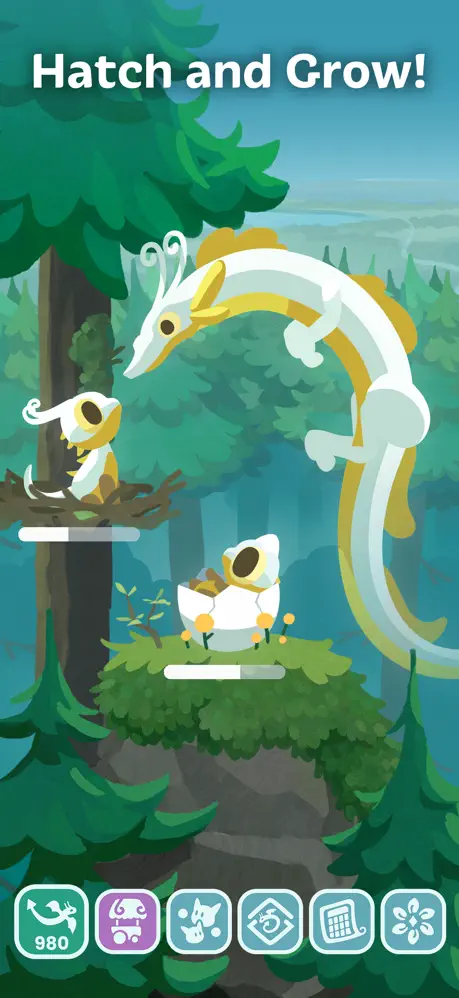
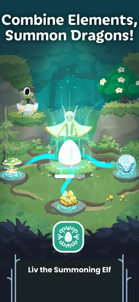
Hatch Dragons is a cozy dragon collection game where players nurture and raise different dragons inspired by the natural world. Launched earlier this year, Hatch Dragons has been an enormous success: With 4.7★ reviews across the apple and android app stores, a steady ~270k DAU and an amazing reception from players.
I worked as the UX/UI Designer on Hatch Dragons, closely working with the product owner and art lead on the project. This Game took existing mechanics from our other games and gave it a new spin and fresh theme. Primarily I was working on the UI Style and layout however I also contributed some UX improvements as well as technical implementation of the UI elements
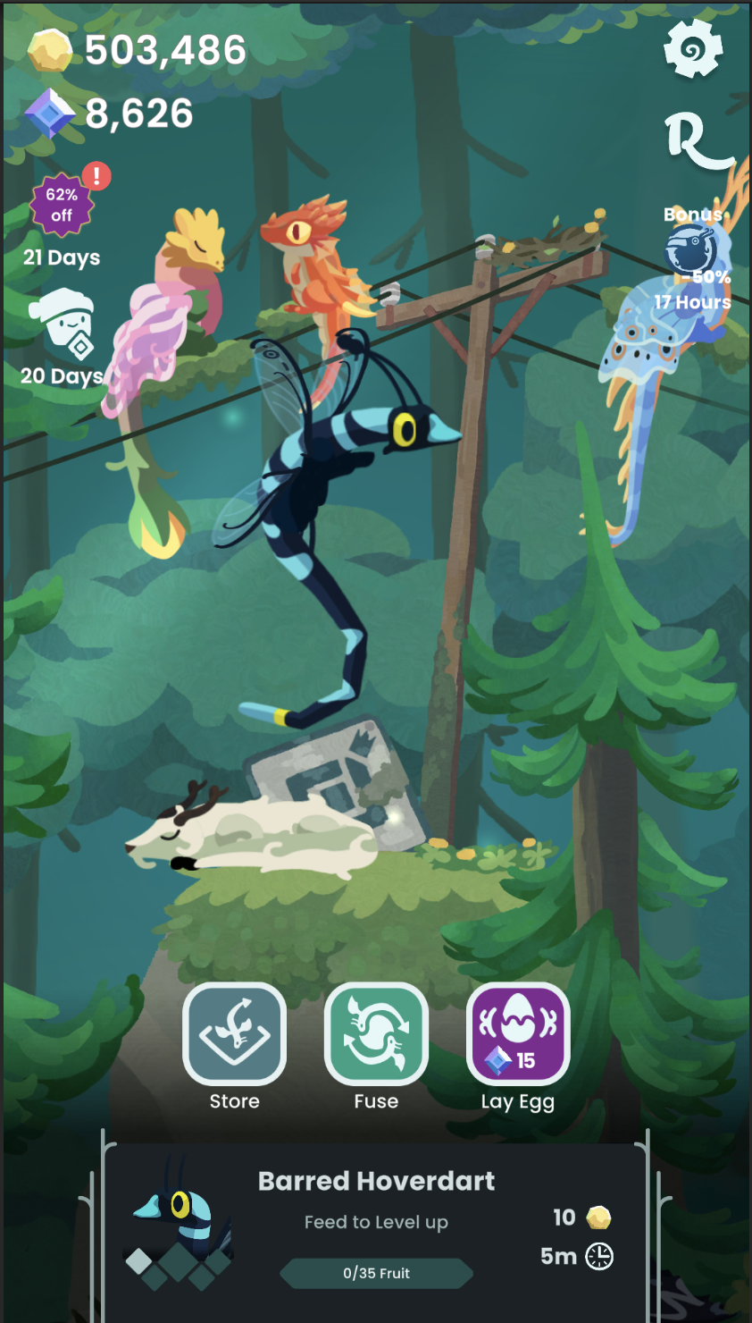
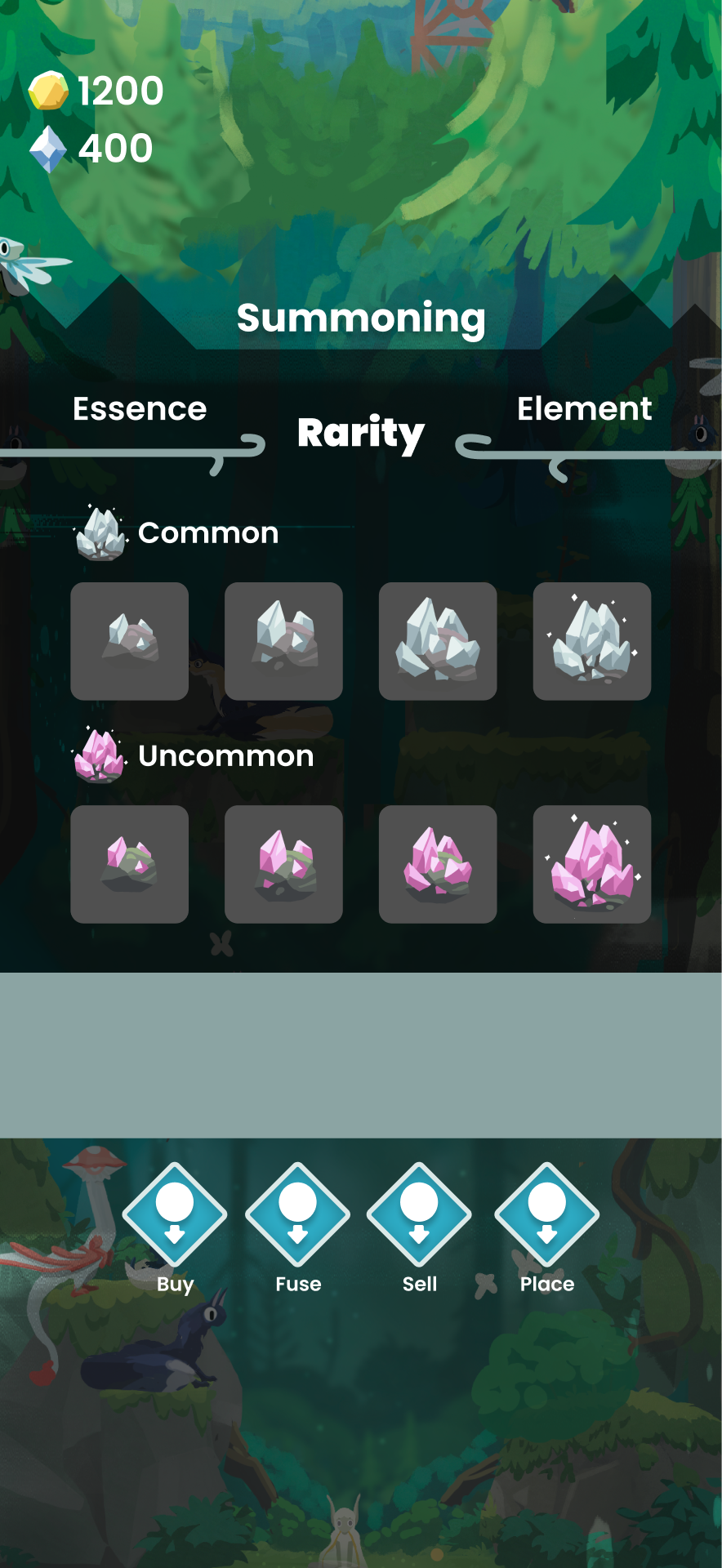
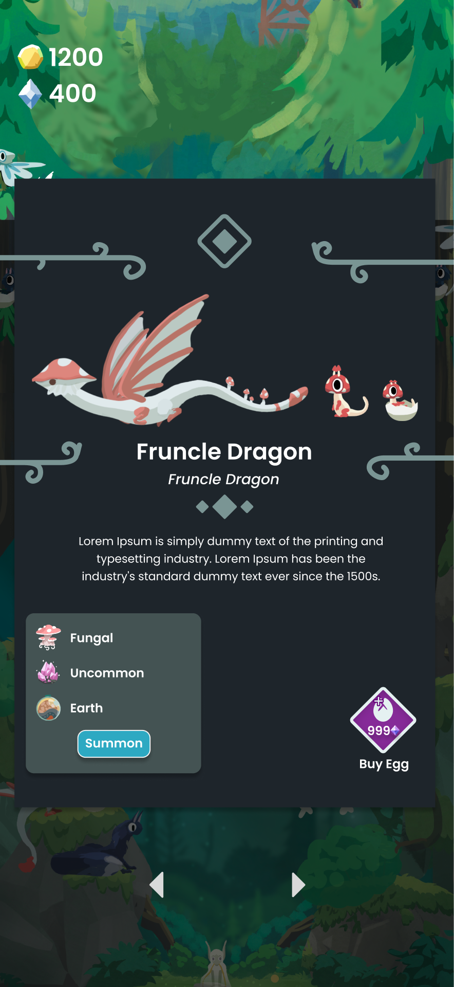
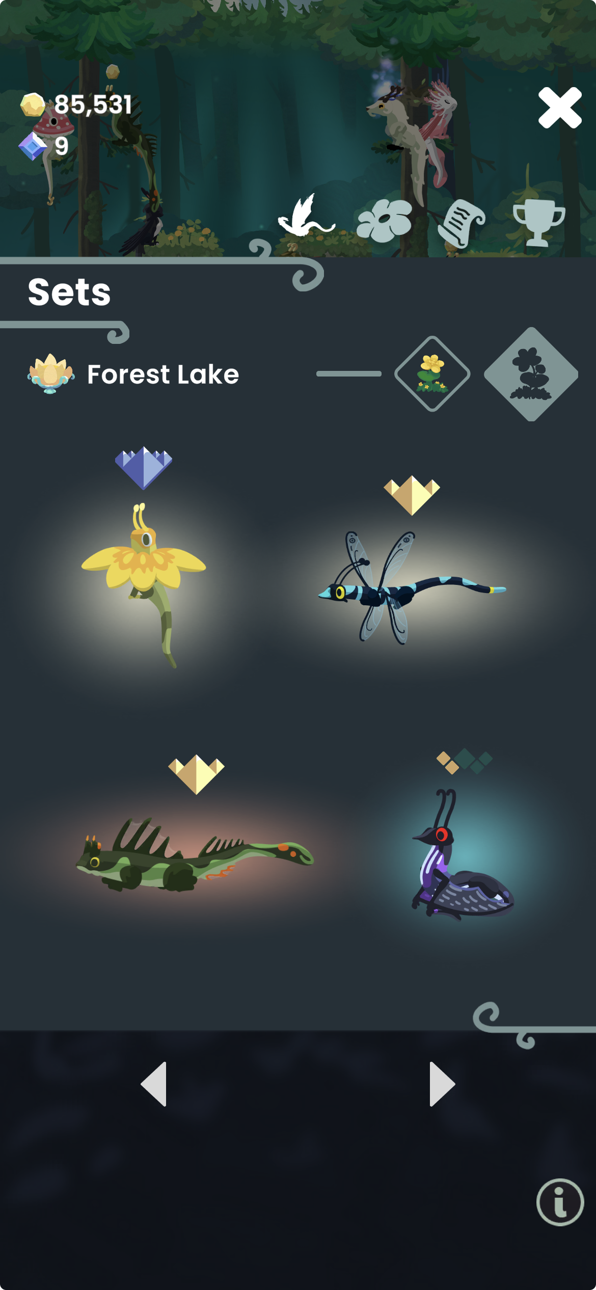
The preproduction work on Hatch Dragons had created a really strong sense of style within the game. My job became to create a UI style that would match that vibe and maintain the relaxing calm atmosphere. After some explorations, mood-boarding and lots of discussions we decided to proceed with a flat, minimal UI style accentuated with organic, fantasy flourishes and iconography.
Early on it became clear we wanted a darker colour pallet for the UIs, to contrast the lush but calm forest. This "dark mode" approach informed the design of the game throughout development. Early concepts used a mix of organic line work and harsher more geometric shapes. These geometric shapes softened as development went on.
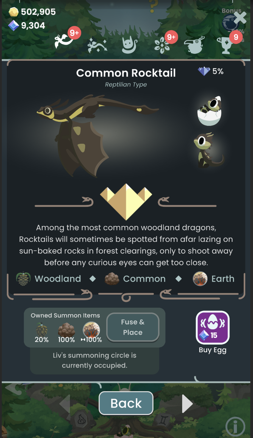
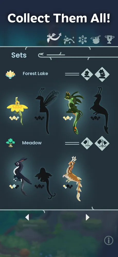
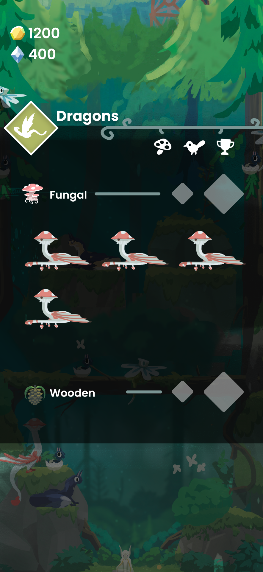
The Codex of the dragon species' shows the evolution, as well as the addition of mechanical visualisations within this menu: with it now showing rarity and dragon level / completion. This menu is still a work in progress as we find the perfect way to visualise things.
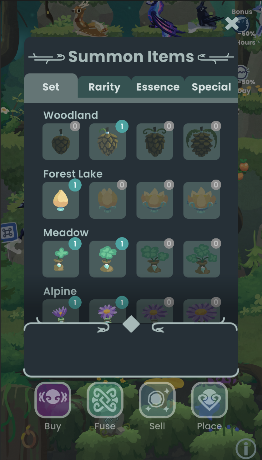
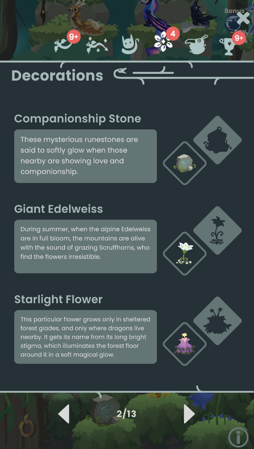
The flat style of Hatch Dragons informed the iconography of the game too. Flat and strong shapes were guided by nordic shapes and ancient simplified shape languages. This was accentuated by the organic flourishes we used through out the game.